Friday, March 31, 2017

3/31/17 Mentor Sequence II


Today's Class- We looked at the latest progress on the newest block, though we are still waiting to see the first proof of that block to see what it will actually look like.  Followed up last week's discussion of block printing on fabric, looking at actual examples and discussing materials that can be used.

This lead to a discussion of Drive By Press, an artist run printmaking group.  Founded by printmaking students from the midwest, what started as in independent project evolved into an industry.  A small roller press was mounted on the back of a pickup truck and this truck has travelled the country, bringing a supply of carved blocks to all kinds of locations.  Sometimes they went to places that had established studios and permanent equipment, including right here at Kean University.   Wherever they went, those in attendance could receive a print from any of those blocks, printed on paper, but usually cloth.  They would put it right on something you provided for a small fee, sell you a shirt with a print, or even put it on paper if you preferred.  Below we see how a block could be printed on an apron, and the resulting piece, created right in VE 209.


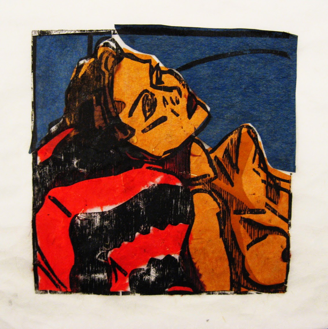
Their visits included lectures on the history of their project and of printmaking in general, as well as displays of prints from many artists, such as the large composite relief print on cloth shown above, or a few highlights from their collection of works on paper from artists they were friends with.


They even helped to develop their own brand of relief ink, specially formulated for block printing on fabric, as in this t-shirt from 2010.

For next class- I expect to see the next block proofed, as well as get an update on the mixed media experiments that we were discussing this afternoon.

3/31/17 Intro to Art


Today's Class- Today the important concept was the idea of narrative, along with a look at symbolism.  We saw some slides of art that tells stories, going from cave painting to the 20th century, stories both true and fictitious.  Then we began on our first individually graded project of the semester (everything to this point is part of the semester portfolio), our major two dimensional project.  Appropriate to the topic of the day, the piece is an autobiographical comic strip, inspired by Art Spiegelman's graphic novel MAUS.

How to make this up- You will be creating a comic strip that tells a true story from your life.  Can be happy or sad, significant or unimportant, whatever you decide.  As in the MAUS example, the characters will be symbols, either with relevance to the story itself, or relevance to you and the people  portrayed in the story.  Below are some student examples from previous semesters: (click on them to enlarge)


The strip will fill two full pages from your 18" x 24" pad and be done in full color- anything that isn't normally white (such as milk) should be in color.  Dialog/thought balloons can also remain white.  Text can be done with pens, markers, and other things capable of lettering.  Such things can also be used for outlining and fine detail work.  The bulk of the color should be done with pastels, either chalk or oil based- inexpensive ones are fine.  There should be at least 12 panels between the two pages, though more is permitted.  Panels can be identical in size or vary within a page as you find necessary.  Pages can be either vertical or horizontal.  

Homework- Work on this project will continue in class next week, and you'll be given time on your own beyond that to complete it before they are due for collection.  That date will be determined based on what is completed next week.


For next class 4/7/17- We will continue on this comic strip 2D project.  While that is going on, I will assist each student individually with the printing project.  Bring your 18" x 24" pad, the completed progress on the comic strip, pencil and eraser, pastels, and the collograph printing plates you made last week.

Friday, March 24, 2017

3/24/17 Mentor Sequence II


Today's Class- Checked progress on some ongoing things, such as the newest block, and the written statement.  We also looked at a few examples of group exchange folios, a common printmaking product where a group of print artists each make an edition large enough that they can exchange prints and all end up with a complete set, for no more than the cost of materials used to make their edition.  I brought in three such sets that I had participated in, each with dozens of print examples from artists from around the country, and a wide variety of print mediums.  Besides including my contribution, each set included work from such nationally and internationally known print artists as Tom Huck, Sean Star Wars. Bill Fick, and others.


Above- students looking at more exchange portfolio prints.  Below- prints displayed by Drive By Press on one of their past visits to Vaughn-Eames.


Homework- Continue on the current piece, which will hopefully be ready to proof by next week.


3/24/17 Intro to Art


Today's Class- Today's topic was printmaking, which includes all mediums that make use of print processes, or using a fixed matrix to create multiples in art.  I showed a few dozen art historical slides, covering some of the history of printmaking.  At the same time I explained aspects of the processes.  We discussed basics of relief, intaglio (etching), lithography, serigraphy (silkscreen), and monotype.  Today's art project was also print related- with the students starting to make collographic printing plates using cardboard and scrap materials, although they may add other things from home before we print from them in 2 weeks.  With one section we looked at the photos students took as part of the photo assignment given a few weeks ago, while the other section got back the graded research assignments.  Next week the two sections will catch up to each other.

How to make this up- The first step is to create a collograph plate.  You will need a piece of flat cardboard like material.  I provided cereal boxes to the students (the broad front or back side is fine, or that of a cracker box will do), or you can use a piece of mat board about 8" x 10".  To the backing board you will need to attach relatively flat material, creating a collage of sorts.  These materials should have a variety of textures, and out process will be to print these textures using printing ink.


Above and below are examples from previous semesters of student collagraph plates and resulting prints.  Prints were made with black printing ink, so the color of the objects on the plates had nothing to do with resulting images.  (in the bowl of fruit above the color was added on top of the dried ink, just as was common going back to the renaissance, and you have the option of doing the same using watercolors or pastels from your kit)


Above and below are two more completed prints from previous semesters. Variations in value and texture in each piece are the result of variety in the collaged pieces, since all were printed with the same black ink.


Your choice of subject should be representational, but otherwise is up to you.  At least eight (8) different textures should be represented in the plate that you make.  You may use any materials you want, though anything too fragile (such as drying leaves) should be coated with spray acrylic or white glue to give it protection, and I advise staying away from cotton balls, which seem like they'd have interesting texture, but they are likely to stick to the ink.  Keep in mind, that the print will be a mirror image of the plate, so if you want letters or numbers to be readable in the print, they will need to be backwards on the plate.

I expect to bring in printing materials (ink and tools) on April 7, 2017, so have you completed plate that day and we'll print them in class while you are working on another project.

Homework-  Our second written assignment, the museum paper, is due on April 28, 2017 to receive full credit.  Students who turn it in by then will have the opportunity to correct any mistakes or omissions and resubmit it for a better grade.  One student turned in theirs already today, so it can be sooner than that if you wish.


For next class 3/31/17- We will be starting the first graded art project of the semester, our 2D final, and not part of the portfolio grade.  It will make use of the pastels I asked you to buy and you'll have more than one week to finish it.  Bring in your 18" x 24" pad, pencil and eraser, and a set of inexpensive color pastels (oil or chalk will work, whatever you can easily find)

Friday, March 17, 2017

3/17/17- Mentor Sequence II


Today we talked about some technical stuff, looked at state proofs of a few pieces, and discussed plans for the future.  I brought up the less familiar, but still relevant, topic of wood engraving, showing book examples of the work of Lynd Ward.  I pointed out that the level of detail he achieved can not be duplicated at that scale wth the wood and tools of woodcut, but did say that one can get a similar effect if the scale you are cutting is large enough.  Below is an example of a large scale woodcut that I produced in grad school, which was influenced by the work of Ward, if not nearly to his skill level.


The actual piece is 44" x 36". Click on it to enlarge the image and see the details.

We also discussed how texture can be used to emphasize parts of a composition and to alter views of space (things with a lot of texture tend to advance, while things without it tend to recede in a composition.  Something to keep in mind.


3/17/17 Intro to Art


Today's Class-  Today's topic was rhythm as a visual element.  Shapes, colors, lines, values- all things that can be used in ways that show rhythm in art.  Sometimes rhythm is not particularly noticed in an artwork, but sometimes it can dominate.  My plan today was to show a few dozen slides with good examples of rhythm as a visual element, and how each artist shown used it in their art, but the projector system kept breaking down.  Each time we ended up moving on to the art portion of the day, which involved listening to segments of 5 different styles of mostly instrumental music and painting abstract compositions in watercolor to the results.  At the end of class we looked at the resulting paintings, to see if we could guess which music inspired each one.  


How to make this up- If you weren't there for class today, you'll have to find equivalent music on your own.  This blog link lists the actual music used and equivalent pieces that can be used to substitute for the music in class.  


To complete the exercise, open your pad to a blank page and have your watercolor paints ready.  As the music selection plays, produce an abstract composition inspired by the music you experienced.  The marks you use, the colors, the shapes, are all your choice, and ideally should reflect what the music made you feel.  I'd prefer abstract compositions, rather than images of recognizable objects.  Above are some examples from previous semesters, and more can be seen on the page with the list of music sources.  This is a portfolio exercise and can be made up any time before the end of the semester for full credit.

Homework- The photography assignment should be completed for next week's class, 3/24/17.  The printed photos can be brought in just as a stack, or mounted to a backing if you prefer.  We will look at the results as part of class.

For next class 3/24/17- Our next project will involve printmaking, artworks produced by using a matrix that sets up the design, such as an etching plate, a relief block, a silk screen, or in our case, a collagraph.  


The name is derived from the word collage, and is basically a collage that is inked and printed.  Above is an example of a plate and the resulting print together, as well as some further print examples.  Next week we will be making the plate, but that takes more than one week, so they will be printed later in the semester.  Adding color to the dry print  (as in the fruit example above) is an option and can be done with your pastels or watercolors.  You won't need the big pad next week, but materials with interesting textures that you don't mind cutting up and gluing down are welcome, as well as having glue.

Friday, March 3, 2017

3/3/17 Mentor Sequence II


Today's Class- Two of the conversations we had today were about potential use of color in woodcuts, and black line/white line approaches to woodcut.  I'll show examples of both here.

Black Line Vs White Line- In a standard black and white woodcut every thing in the image is either black (ink) or white (paper), although optical gray tones can be achieved by mark mixing.   When we think of line, most people assume black on white, as in pencil on paper, or black relief ink on paper.  Woodcut images can be produced that are essentially reproduced drawings on paper, and my Fourth of July series shows examples of how this idea can be explored.  

The first one (October 20, 1993) is essentially a reproduced black line drawing on white paper, or what is sometimes called "black line" technique.  The leaves are drawn with simple contour lines and then all the negative spaces were cut out, leaving behind black lines.  The inked block reproduces those black lines.


The second one (October 14, 1993) depicts a bowl of rice noodle soup being eaten with the aid of chopsticks.  The chopsticks are shown as a black line drawing, as is the hand holding them, and the contours of the bowl.  However the noodles are carved out, what could be called "white line" technique.  This image shows both black and white line being used in the same piece.


The third print (September 12, 1993) makes reference to a conversation with some fellow art students and depicts a bunch of animals, which I did as carving white lines into a solid black background.  The result is essentially a white line contour drawing, the lines carved with small gouges, mostly a v-gouge.


My approach has always been to use whichever style makes sense for the composition.  Sometimes it's all black lines, sometimes it's all white lines, and sometimes it's both.  You should also feel free to use the kind of lines that make sense for the piece you are working on that moment.

Color in Woodcut


Color can be a useful tool for any artist, and that includes woodcut.  Color can be in the form of ink, of paper, or other options.  Over the past 20 years, most of my color use has been in the form of hand coloring, the most common approach to color in western prints going back to the renaissance.  In those days it was common for print artists to print woodcuts and etchings with black ink, after which the prints would be turned over to other artists to apply color, generally done by painting the printed paper with some kind of pigment.  My preference is to use watercolor, which requires a lot of work, but gives me most control over application and creating precise colors.  Above is example from my Floating World series.  Today I also mentioned that colored paper can be used, and below is an example I did like that.  This particular one started with a collage of decorative colored paper, on which an image was printed with black ink from a wood block.  Not nearly as precise as the watercolor approach, but a much bolder use of colors.


Pre-cut pieces of colored paper were place on the inked block, the ink helping to hold them in place.


Glue was added to the tops of the cut paper, then a larger piece of print paper on top of everything.  Hand printed after that, which transferred the ink to the cut paper and to the large sheet, as well as gluing the small pieces to the large sheet at the same time.  Below are the results.


Homework- Spring Break this week and you seem to have a plan for what you will accomplish in that time.  I look forward to seeing the results when we return.  I do hope to see an early draft of
 your artist statement for the show soon.  Putting words about your work down on paper may help your realize new things about it and what you are trying to do.

For next class 3/17/17- Expecting to see the current block finished and a new one started.

3/3/17 Intro to Art


Today's Class- Today's topic was photography- its history and its uses in art and other ways.  I showed about 40 slides with examples of photography, examples covering from the earliest experimental methods of the 1820's to present day.  Besides covering the changes in technology, I discussed how ideas common to all art were absorbed into photography.  A take home assignment was given out.  Since this left us with a lot of time left, we did a quick tour of studio classes in the building, so our class could see the facilities and learn about the kinds of classes offered.  The research assignments were collected.


How to make this up- All work done for today will be in the form of a take home assignment, 20 specific kinds of photos to be taken and printed, and brought to class to be shared in three weeks.  Below is a student example of part B- a story told in 6 frames.  (click on it to enlarge)


Additional information about the assignment and further student examples can be found here.


Homework- The take home photo assignment should be completed and brought to class on March 24, 2017.


For next class 3/17/17- Back to color, along with the idea of rhythm as a visual element.  Bring your 18" x 24" pad, watercolors, brushes, water container, and palette.