Thursday, April 30, 2020

3D Final Project


Sculpture is a catch all term for artworks created as three dimensional objects, generally with no practical function.  Traditionally, there were three main approaches.  Carving is a subtractive process, where material is removed from a hard substance to reveal a desired size and shape.  Sculptures made in stone or wood are typically carved. Another traditional process was casting, where a soft substance is put into a mold, and when it hardens, the finished sculpture can come out.  This was the common way bronze sculpture was done.  Modeling is where the artist takes a soft substance and works it by hand (or simple hand held tools) to create a sculpture.  This is how clay works, though often the soft clay is later kiln fired to make it hard.  A modeled clay piece can be also used to create a mold for casting metal, or as a reference for a larger stone carving.  Molten glass can be modeled by hand (with tools- at 1700 degrees Fahrenheit it is too dangerous for bare hands) or shaped in molds.  

Then came the 20th century, and all the rules changed.   All those old processes are still done, traditional processes and materials, for those who want to learn them.  However, many artists turned to new ideas and materials.  One such change was assemblage, sculptures created by adding things together.  Didn't even have to be traditional sculpture material. but could be what are commonly called "found objects", or just stuff that is around.  Many of the earliest cave sculptures appear to have been inspired by the object used to make it- the shape of the original piece of wood, stone, or bone probably looked like the object being represented by the artist.  This new form of sculpture didn't have to be marble or bronze, but scrap metal, plastic, or just existing manufactured objects could be turned into art. Shore area artist Lisa Bagwell made this egret from mostly plastic utensils and wooden pencils.  She has also done wonders with things found as part of beach clean-ups, but I'm not going to talk about those here.


Build a whole environment to hold that piece, and you have what is commonly called an installation

Slide Show-
Donatello A carved wooden sculpture, Mary Magdalene
Michelangelo A carved stone sculpture
Picasso a found object sculpture made from bicycle parts
Duane Hanson- A cast sculpture (plastics)
Joseph Cornell- Known for wall mounted box sculptures
Duchamp- Famous for developing the "ready-made" concept
Edward Keinholz -A classic installation sculpture

Our project is built on this idea of found object assemblage, which works well in our pandemic era, but I've been having students make things out of inexpensive or found objects since well before this, as in these student examples from past semesters.  Back on April 9, 2020, everyone was sent a list of randomly generated phrases, right to your Kean mailbox, phrases from words drawn from hats. One was to be used for a mixed media collage. Choose a different one for this project, your 3D Final project.

As with the mixed media collage, it is up to you to interpret the phrase you are using.  Choice of materials is completely up to you. Processes are completely up to you.  Just a few rules-

1) The piece must be three dimensional, occupying space. Can be free standing, on a pedestal, or contained in a box. There are examples of all these options shown below.

2) The finished piece must depict your chosen topic in some way.  (it's your interpretation)

3) You may use manufactured items that already exist, but your final piece must be unique to you, something you made yourself.

And that's pretty much it.  It's due on May 8, 2020, our final class meeting.  When you send in the photo, include your inspiring phrase, a list of materials, what it is about.  I've attached a number of student examples here, so you can see how others have handled it, maybe get a few ideas of your own.
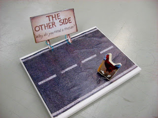


"Chicken Story"
Cut magazine images, hard rubber, etc.


"Against College"
Computer generated images, foam rubber, etc


"Sting Despair"
Clay, leaves, paint, cardboard box top


"Apetite for Distraction"
various found objects, clay


"Fallen Merchant"
Various found objects


"Planet Gone Wild"
styrofoam, wires, various found objects


"Plowing through the Nation"
wood, computer generated images, found objects


"Impasse Changed"
Existing cardboard boxes, paper, found objects


"Let's Get Hearts"
Existing cardboard box, paper, paint, found objects

Sunday, April 26, 2020

Semester Final Portfolio


Lately I've had a number of inquiries regarding the semester portfolio, perhaps because the semester is coming to an end in a few weeks. So this seems a good time to post something about it.

If you look at the syllabus, there is a breakdown on the 3rd page for Assessment, which covers how the grades are calculated.  There are three individually graded items (2D,3D, and Museum assignment), and everything else we do is part of the semester portfolio. This is worth 25% of your semester grade.  These are all the things we do in the classroom, the art exercises, usually done in the 18"x24" pad.  The last few months you have had to do them at home.  It's pretty much a completion grade- you complete the assignments and you get all the points.  Normally on the last meeting day, after we have all looked at the 3D final projects, I quickly look through all the big pads, and use a check sheet to see what people have done.  If all the items are complete, that student gets an A for the semester portfolio.  If some items are missing or incomplete, the final grade for this item is lower, based on a system I have.  In either case, it is calculated into the final class grade that I have to submit through KeanWise a few days after the semester ends.

Unfortunately, this year we can't have a final meeting in the classroom, so you will have to send me images of what you have done through the email system.  Some of you have been doing this all along, and if so, I have my check sheet and mark them down.  Some of you have sent me your comic strips that way.  I don't know if there is a limit to how many items can be attached- if so you may have to do it in batches.  No problem- that's why I have the check sheet.  Once I have things written down, I send acknowledgement, so you know and you don't have to send them again.  Excused absences cover penalties for missed classes, but all portfolio exercises have to be made up and completed, whether the absence is excused or not. 

The good news is that everything this class does is kept on this blog, so week by week there is a record of what the class is doing. Early in the semester when we were meeting in the classroom, if you did the work in class, then the exercise is complete.  I still want to see it again in May so I can give you a grade, but you at least have it done.   Work done since we switched to distance learning will have to be sent digitally.  If you are not sure what any of this is, it's all on this blog, but here I will provide a list of dates we did these exercises.  The last several postings are on the home page, and after that, everything can be found by clicking on "older posts" or going into the archive function, which covers everything going back to 2007.  This is not an ideal system; I much prefer to see art in person and judge it that way, but this is what the pandemic circumstances requires.  

Jan 31- Contour line (exterior, cross, blind).  The shoe drawings, 4 varieties.
Feb 7-  Scale, Proportion, and negative space (the chair, and the bottles, two exercises)  
Feb 14-  Value drawing.  Charcoal drawings of white painted objects
Feb 21-  Monumental art (mosaic collage with magazine paper)
Feb 28-  Basic color theory (the color wheel and the complement color mix, two exercises)
March 6- Photography- take home assignment
April 3-  Rhythm- abstract art influenced by musical rhythms, four paintings.
April 17-  Mixed media collage- adapting a randomly generated phrase through use of collage, drawing, painting
Apr 24-  Perspective in drawing- a 2 point perspective drawing of the corner of a room

That is the whole portfolio.  Details about each exercise can be found on the blog under the above dates for each, and if you have further questions, you can email me.  To count, I must see the work by midnight on May 8, 2020, our last class meeting. None of these items are individually graded, so if they are all done, you get an A for the portfolio.

Friday, April 24, 2020

4/24/20 Introduction to Art


Today's class- The idea of drawing in perspective has existed throughout the history of art.  Drawings are two dimensional artworks, and when they depict things that exist in the real world, which is three dimensional, there are going to be problems.  When I showed the slide of that ancient cave drawing on a wall, everyone quickly identified the subject as a horse, a bit of success for a 15,000 year old drawing with no title, no artist statement. That's a lot of power for a line made with soot. Yet I doubt anyone in the room believed it was a real horse- it was a series of lines on a rock wall. One thing our unknown artist(s) did was indicate the two legs on the far side of the body with implied lines, technically not connected to the exterior contour of the horse as drawn, but put in about the right place so the viewer's brain can make the connection, and complete the image. 

One of the inherent flaws of drawn images is that they can only approximate a three dimensional object or space, sacrificing reality in favor of communication.  But they can communicate quite a lot, and during the renaissance, artists learned how to communicate a lot through drawing.  Toward this end they developed perspective systems, applying advances in mathematics and physics to art, using a set of rules and standardized distortions to account for the missing third dimension in a two dimensional drawing.  Today we will use a common perspective system to render a viewable three dimensional space and structure.

Slide Show-
giotto we saw this example last time, a skilled artist showing an understanding of space, but lacking a perspective system.
Raphael a painting done with one point perspective, to depict an imaginary piece of classical architecture suitable for this tribute to logic and order.


How to make this up- The assignment for this exercise is to draw the interior corner of a room.  Normally we do this in the classroom in two point perspective, and there is a student example at the top of this blog post, a typical Vaughn-Eames classroom.  Since we can't be there this semester, you'll have to choose a room wherever you are sheltering. 

Back when I first leaned two point perspective drawing, we covered the basics for showing an exterior corner (two point works very well with architecture), then were taken outside to render the outside of a cantilevered campus building in that system.   While still sitting there in the field, we were given a weekend homework assignment to draw an interior corner in two point perspective, but no further instruction.  That Sunday there were a lot of desperate first year art students trying to figure it out, calling each other, not easy in the age before cell phones had been invented (or the internet) and most dorms did not permit land lines in the rooms, leaving us just rotary dialed extensions in the hallways.  (if you don't know how a rotary dial works, ask an older relative- they may know) I decided that if renaissance Italians could figure it out, this 20th century Italian could look at drawings, look at rooms, and figure it out.  And eventually I did, spread the word on our phones, and we all got through the assignment.  I'm going to make it a little easier for you.

Start with a piece of blank paper.  A page from your 18"x24" pad works well, but whatever you got. Choose a pencil that you like- you may need to erase, so pencil is better than pen. You will also need some kind of straight edge, larger is better.  In class I bring in an assortment of yard sticks for the class to share, inherited from my hardware store owning grandfather. Some are even printed with the name of the store, the products, and the phone number- CAstle 3-3464.  (how do you dial that? ask that same older relative)


First step is to draw in a horizon line, also known as eye level.  To make it simpler, put it near the center of the paper.  Near each end mark points that will function as vanishing points (VP in my diagram) If it helps, look at all the images first and see where you are going.


The next step is to put in a vertical line to represent the corner of your drawn room, which should be perpendicular to your horizon/eye level line.  The top and bottom ends of the line represent the ceiling and floor corners, so you can estimate how far it extends above and below your eye level.  Leave room around it for the eventual wall lines.


To create the lines that represent the top and bottom of the wall itself, place your straight edge so that it rests on one of the vanishing points, continues across to one of the top or bottom ends of your wall corner vertical line, then use the pencil to mark how that line continues across the page past that wall corner.  Do the same at the other end, then move your straight edge to the other vanishing point and complete the ceiling and floor lines of the opposite wall. Keep in mind that all horizontal lines that make up a wall, and anything parallel to that wall, must point to a vanishing point on the other side of the paper. The V shapes at the top and bottom are because of how things are perceived to diminish. (I left out the floor line on the right to leave room for furniture I'll be drawing in later) In most rooms the ceilings are parallel to the floor, and the wall height should be identical along its length, but in viewing the corner, it is the farthest thing from you in the room, so the wall feels smaller there, thus you show it as smaller.


Your drawing must include a door, so choose a room that has one.  Remember that any horizontal line on a wall must vanish to the same point used to make the wall itself.  Lay your straight edge down so it is along the opposite vanishing point, crosses the corner line, and then use it to mark the top of your doorway.  Estimate by observation how far it is from the corner to the door, the width of the door, and the space between the door top and ceiling, and draw in that line.  (these are all negative space, but you are drawing the lines of architecture) Then draw the two verticals that join the top of the door to the floor.


You must show something on the opposite wall.  Can be a framed object, a poster, a window- whatever you got.  Since it is on the wall, you use the vanishing point on the other side of the paper as your starting point.  Probably doesn't go all the way to the floor, so you'll have to draw a bottom edge as well, but otherwise it's the same process as drawing a door.


Making a piece of furniture (dresser, desk, book case, table, or whatever you have) on one wall is a little more complicated, but by now you are a pro and can handle it.  Estimate where it will go, and put in the line that shows where it sits against the wall.  Anything on that wall must vanish to the point on the opposite wall.  Edges that are perpendicular to that edge along the wall (and thus parallel to the opposite wall) must vanish to the other vanishing point, the one on the same wall.  A straight edge that connects the left side vanishing point to the first line out from the wall shows where to put the front edge of the furniture.  Draw that line in.


Last step is to finish the furniture.  Vertical lines connect the top corners of the furniture to the floor, and the two vanishing points that made each top edge will show you where to put the bottom edges.  And that is all you have to do, and now you know how to render the inside of a room in two point perspective. 

My example is imaginary but yours should be real.  I won't be there to see the room itself, so I will have to trust your estimates for sizes and locations.  Your drawing must include the corner, ceiling and floor lines, a doorway, something on the wall, and a piece of furniture.  This is a portfolio exercise, due by the last day of class, just a few weeks away.  This is the last portfolio exercise of the semester. 

Homework- Nothing new, but if you are past due on your paper or the comic strip, you should get moving.  Our last class is on May 8, 2020, so that ends the semester.

For next class May 1, 2020- We will be starting the final project, a 3D assemblage sculpture, making use of another one of those 4 phrases you were sent a few weeks ago. Examples will go up during the week.  Details and more images to be posted that day.


Monday, April 20, 2020

Drawing in Perspective


On Friday we will have a lesson in drawing in perspective and complete an exercise where you have to do it.  What is here today is just background, but it may explain what the goals are better.

One of the biggest problems faced in drawing from objects, is that we live in a three dimensional world, and drawing is done on two dimensional surfaces.  Rendering a single object on such a surface isn't too difficult. You've seen the example in class of a horse drawn on a cave wall, and had the experience of drawing a shoe on paper. Putting a few bottles on paper, while still showing their relative position and size is a little more work, but use of negative space and keen observation can make that possible, too.  Same case with white painted objects in our charcoal drawings.  No one would be fooled into thinking they were seeing the actual objects, but if properly done, a typical viewer would have a good understanding of what the artist had seen and rendered.  

Make the space depicted much bigger, increase the number of objects, and it becomes more of a challenge.  Luckily most artists like a good challenge. Through the ages, and around the world, any society that valued accurate rendering of objects and place, artists tried to step in and solve the problem. Some artists had good instincts, and were able to deal with some of this in their own style. Some relied on perspective systems, logical organized standardized systems for rendering what we see, while accounting for that missing third dimension.  Oblique perspective, isometric projection, and many other systems were tried, and all contributed to viewer understanding, even if they didn't completely solve the problem. 

A few years ago one of my college friends hit me with a problem via email. Doug had recently seen an exhibition of Raphael's work and was very impressed with his paintings of halos, which were the ring type that hovers over the head.  The question was how had he made these perfect ellipses.  (the proper term for a circle seen from the side- think of the bottoms of bottles that we drew in class)  I knew this guy originally from freshman year when we took advanced calculus together.  He did well, majored in math, and eventually earned his PhD in math and now teaches at a college down south.  (online of course, as schools down there are going through the same thing we are) I did not do so well, became an art major, earned my terminal degree in that field and teach art at Kean.  His assumption was that they were conic sections, a mathematician's solution to this perspective question.  My reply was that I didn't have a definitive answer, but I knew that Raphael was even better at drawing than painting (Doug's recent viewing of his work caused him to agree with this), and he probably could freehand a perfect ellipse.  And if not, perspective could be used to find it.  In the renaissance era, parents with the means to educate their children got them lessons in perspective.  It was the key to employment in many fields, ranging from firing artillery to cartography, navigation, architecture, engineering, city planning, and of course, art.  Knowledge of perspective was the key to getting an apprenticeship, which was the first step in employment.  Not knowing more than that, I did a little research into the matter.  A few hundred years earlier, the master of art in Italy was Giotto, who had no formula, just good instincts for indicating three dimensional space.  The style of halo that was favored in this era was a golden disc that sat behind the head of the honored person.  No problem if everyone is facing the viewer and nothing is behind them, but as Giotto was introducing more three dimensional space into his paintings, problems arose, as in this example from around 1300.  Individuals facing away from the viewer had a face full of halo.  The ring style ellipse hovering over the head was a solution by the time Raphael was painting.

Meanwhile, math and science were also evolving, as humanity struggled to figure all this out.  Through the course of history, usually it is the artists who get there first. If the goal of a particular style of art is to render with accuracy, careful observation and reproducing the results, this is an area where artists have a distinct advantage.  (halos are an abstract concept, so nothing to observe, just good guessing) They knew how to see the shapes of things.  They learned how to use the negative spaces to put them in locations relative to each other.  They learned how light and shadows in the image could be used to focus attention, and to indicate times of day, as in the examples you saw from Edward Hopper paintings during our lesson on value. They learned how distance can affect color, what became known as atmospheric perspective, where the accumulation of air makes distant objects seem more faded, and colors cooler (dark brown and gray mountains appear blue and purple in the distance because otherwise invisible air does refract a small amount of blue, and put enough of it between a viewer and the thing being seen, the objects being viewed take on some of that hue).  Just became another part in the artist toolbox, which could be used to depict the world.  We looked at it in our talk about color theory.  So artists used what they knew, and (usually within a generation or two) scientists figured out why it was happening.  

The need to depict detailed and complex spaces and show them as three dimensional on a two dimensional surface resulted in the development of perspective drawing in Italy during the renaissance, and it quickly spread throughout the world.  One point, two point, and three point systems were developed, each better for different purposes.  All had in common the idea of a horizon line, which is also commonly called eye level.  The points are actually vanishing points, places that horizontal lines all seem to point to.  One point perspective is that classic design of looking down railroad tracks disappearing into the distance. Logically we know that the two rails must be the same distance from each other over the whole length, but as they get further away, we perceive them as coming together. (physics tells us that things diminish with regularity as distance grows, which is the key to all perspective systems) Works best with singular items shown in the center of the image.

Piero Della Francesca one point example

For multiple objects in view, at similar levels to the viewer, we often use a two point system.  Two vanishing points are placed on the horizon line, at either end.  All vertical lines remain vertical, but any line that would be horizontal has to point back to one of the vanishing points. The down side of this is that the further we move from the center of the image, the greater the distortion becomes. We will cover this in the portfolio exercise this coming Friday.

There is also a three point system, which is employed when the depicted object or scene extends far above or far below the horizon line, but we are going to skip that- not needed for this assignment. 


Friday, April 17, 2020

4/17/20 Introduction to Art


The original plan for the next assignment was a multipart collagraph project. On your syllabus, this is listed on March 27th and April 17th, and you would complete it on your own as part of the semester portfolio. The process is creating a printmaking plate through collage, then applying black relief ink and printing in a traditional print process, and there are many options for doing that. Here's a student example of what we used to do those first two days, the original plate and the resulting print: (notice the mirror reversal effect and that the original colors of the plate have no effect on the black printing ink)


Then the school put more emphasis on projects involving texture and collage, and coloring the piece went from being an option to a requirement, by use of collage and/or hand coloring with pastels, watercolors, or whatever students found. This one below was done with highlighter markers, which added color without hiding the original texture captured by the printing ink.


Unfortunately, most of the materials and all of the tools and process knowledge came from me (I am a printmaker by training and practice) and we are all banned from campus right now.  The process is not that difficult, and you can probably find out how somewhere on the internet, but the acquisition of materials and tools can be a challenge and expense, so it's gone for this semester and is replaced with a mixed media collage that can be done with things you have.


Today's Class- mixed media collage-


Last week everyone was sent by email a list of phrases created by random, nouns and modifying words picked out of hats and combined to make a new one.  Choose one for this project, save one for the 3D final.  The others are yours to do with whatever you want.  We don't need them here. 

How to make this up-


Take one of the new phrases you received in the email and use it as the subject of a new artwork, which will be a mixed media collage.  How you interpret that phrase is up to you- be as literal as you want to be, whatever the word(s) mean to you.  Here are some examples of the assignment done by past students, along with the random phrase that inspired it.  Shows approaches that students have taken with this assignment and what is possible and permitted.


dangerous roots


 city of zoo

 seeds of dreamers

 untamable deluge

melancholy moment

 give us the pragmatic

tangled men

As you can see, this assignment gives a lot of possibilities.  We do have a few rules to follow.

1) The final piece must address your topic in some way. As I wrote above, how you interpret is up to you.  

2) The piece must make use of some collaged materials (from newspapers, magazines, photocopies, internet, wherever you can find things), some drawn marks (can be pencil, charcoal, pens, markers, pastels, crayons or whatever you can find, images or abstract marks) and paint (your watercolors, or whatever equivalent you can find- shoe polish, nail polish, etc.)  In all cases, use these things to create images, fill backgrounds, add color, whatever makes sense to you, but all should be present in some form.

3) You may draw or paint on top of collaged images, either to alter the image or just as part of your overall design.


Flat lightweight things are easier to work with in the collage format.  We have a true 3D sculpture project scheduled for May.

This is a portfolio exercise, due as part of the semester portfolio by the end of the semester, though you can complete it any time.

Homework- Some of you are all caught up on the graded assignments, and we don't have another new one due until the end of the semester.  Some of you still owe things.  I'll post a list of what is in the semester portfolio next week, but if you can't wait until then, just go through the blog for this semester and see what we did.


For next class, Apr 24  The last portfolio exercise of the semester, an assignment in perspective drawing. You will need paper, pencil, and some kind of straight edge.


Friday, April 10, 2020

4/10/20 Introduction to Art

Normally we would have class today, but according to the official academic calendar on the website, today is the first day of the Easter Recess, aka Good Friday. And that means no classes right now, in person, or online, so we get the day off.  If you are here looking for a new assignment for today you won't find one.  Next Friday, April 17th, there will be something new to do. Meanwhile, if you are here, maybe you want to scroll down, see if there is anything you missed.  Less than half of the registered students emailed me their completed comic strip project, our 2D final, and if I don't see it, I can't grade it.  I do accept work late (some points is always better than no points) up to the last day of class, and after that we are done.  Work older than what is shown on the home page can be seen by using the archive function.  So enjoy the day off, and be ready to make more art next week.

Thursday, April 9, 2020

Dada and Randomness


An odd art movement got started early in the 20th century and spread throughout the western world. One thing that made it odd was that no one was sure what it was, or what it should be. It was called Dada, and they weren't even sure why that.  Maybe the name was randomly chosen from a book.  Maybe it was the name of a child's toy. Maybe it was a random sound and meant nothing.  All these ideas relate to it and are part of it.  It has sometimes been called an "anti-art" movement and that also seems at least partly true. One common characteristic was randomness, making artistic decisions by random action, rather than traditional aesthetics or formal issues.  Here is an example of a more recent related activity:

Years ago I had a co-worker who had training in both ceramics and photography.  One thing she liked to do was print her photographs as postcards, and any time she ran across an address, she would send an anonymous postcard. Found mine on an old envelope, which resulted in this showing up in my mailbox a few weeks later.  The original Dada movement is long gone, but aspects and activities live on in art today.  


For example, the Dada movement was big on collage. Could be a photo collage, where the whole image is made from cut up pieces of photographs, assembled to make a new image. Could be a chance collage, where small elements (any medium) are dropped on a surface and glued in place wherever they landed. In three dimensional terms, there was assemblage, where the artist would gather a bunch of things, either already made, or sculpted by the artist, or both, and build it into an artwork.  

One thing that is still common today, is using random chance as a way of creativity, leading the artist to something that otherwise wouldn't happen.  We will use it some ourselves for some of our planned artwork. I have taken dozens of words from the headlines of Book Reviews in the Sunday New York Times, cut then out, attached them to paper, grouped as nouns or modifying words/phrases.  I have several of these pages. 


Made a bunch of photocopies of these pages, then cut out the words again, placed them (grouped as before) into hats. 


In class, I would typically have students pick slips of paper from each hat, the two bits would be joined together, to result in a new randomly created phrase, noun and modifier. These phrases will be the subject of two of your assignments.  You will receive four such randomly created phrases in email today. No one else in the class will have the same ones. The attached letter explains further.  Hold on to them for now.  The first assignment they are for will happen a week from tomorrow.


Thursday, April 2, 2020

Art Materials

Back on the first day of class I distributed the syllabus, which included a materials list.  This being a studio class, art materials are a necessary item. Of course, back on the first day most of us hadn't heard of any corona virus, but now we all have and it's had its effect on much of what we do.  I have had a number of students report that now they can't get access to their art materials.  A few tell me that they were locked out of their dorm rooms without warning.  Some are quarantined at home.  Many stores have closed.  I asked my supervisor for enlightenment and suggestions.  Here is what I have been told:

Our policy is going to be to ask students to do the best they can.  If you went out then and bought everything from your list, you got all the things we will need. If you have access to all those things, you will be in good shape. Each week I list the new project and the materials needed to do it. The materials have been chosen that will bring in the best results.  If you have them, then definitely use them.  So what if you don't have access to those materials?  This is where you do the best you can. 

Be creative, which seems appropriate for an art class.  Could be worse.  On our last day of meeting we took a brief building tour and you saw some of the studios, which are also all closed right now.  Imagine taking furniture design, and no longer being allowed to use the wood shop, those giant tables, and all the clamps, power saws, drill presses, etc.  Could a table be made without them? Of course, people were building tables with hand tools for thousands of years, and I have built much furniture myself that way.  It helps that I had a grandfather who owned a hardware store and I have inherited a large supply of tools.  If I didn't have those, I'd be out of luck. And I have no idea how that class is being taught over the internet.  Everything in the Intro class can be done at home, and now it will have to be.  

When I was in college, I had a housemate who spontaneously decided to do a drawing using boot polish, the waxy kind that comes in a tin, applied with a stick. She had a boyfriend in ROTC, and access to the stuff.  And she was not an art major, but a chemistry major. But it turned out pretty good.  Would not be my first choice of medium, but as a result I know a drawing can be made with boot polish.  When in grad school in the midwest, I knew people who made art with cattle markers.  If you are not familiar, they are big fat paint sticks, about the size of a toilet paper tube, with a paper covering like a crayon, come in a variety of bright colors, and used on ranches and feed lots to mark the sides of cows.  Can they also make art?  Turns out yes. Artists also have a long history of making use of unusual spaces.  Greenwich Village, SoHo, Chelsea, these had been industrial neighborhoods, and were abandoned.  Artists saw available and cheap spaces that could be studios and galleries, and moved in.  Then other people saw how nice they could be and the artists can't afford them any more.  They will just find new spaces. This is what happens to artists.

My point is, if you have the material chosen for the art assignment, use it.  They are designed for that purpose and you'll get the best results.  If you don't have them through no fault of your own, tell us that, and look for a good substitute.  We artists are an understanding bunch. And be glad our class does not involve making tables, or jewelry, or ceramics.  


4/3/20 Introduction to Art


Today's Class- Our topic today is visual rhythm.  Most people are familiar with the concept of rhythm and how it applies to sound, a component of music found all over the world.  However, rhythm can be part of visual arts as well.  Early this semester when we were talking about the variety of line that can exist, we were also talking about rhythm.  As with music, visual rhythm can be very regular, very irregular, and anything in between.  In the same way, it can be simple or complex.  Visual artists have learned how to use it in various ways.  

Slide Show- Let's look at some art examples from the early 20th century Dutch artist Piet Mondrian. Like many modern artists, he had roots in the previous century, and more traditional rendering.  This first image is a 1909 drawing he did of a church at Domburg, and it is rendered in a fairly naturalistic style.  A viewer can get a sense of the relative size of the parts, the structure of the building, proportions, exterior features. If we saw a photo of the actual building, we would probably recognize it. However, Mondrian was a modernist, and simple and accurate rendering of things was not his main interest.  


By the time of this 1914 drawing, Mondrian is moving away from the idea of accurate rendering, more interested in the feel of proportion.  Some aspects are still recognizable- the pointed tops of the Gothic style windows, a crucifix, simple rectilinear structures that seem to echo the stone structure of the building.  At the same time, it is not that actual building, though some of the rhythm remains.


This 1915 drawing moves even further away. Still hints of those pointed windows, but the structure is much more vague.  Now it seems to be all about rhythm. The drawing is a bunch of horizontal and vertical lines, some in isolation, some grouped in two, three, or more.  They no longer represent architecture, but we now have a drawing that is almost pure formalism.  It's now about the rhythm of the lines, proportion of line to space, the vertical and horizontal movement set up by the lines. 


I don't know if this 1916 painting below is derived from the same church drawing, or if he is just making use of the same kind of rhythm.  However, there does seem to be a relationship.  There are dark lines, shorter than before, but also limited to vertical and horizontal, and not representing any recognizable image. Some by themselves, some intersecting with others.  Behind the dark lines are small blocks of color, sometimes bound by the dark lines, and sometimes not, but it all seems very random.  More empty space around the networks of lines, which has an effect of the rhythm of the painting.


When Mondrian reaches his mature art style, what he became known for as in this 1930 painting, there are still dark lines and blocks of color, but the lines are fewer and now form discrete boxes, which may contain the white of the canvas or solid primary colors.  The rhythm has changed considerably.  The piece seems more about the proportion of line to shape, square to rectangle, light to dark. 


But there could still be variety. Mondrian moved further and further west to escape from World War II, and this next piece represents living in New York City.  It's called "Broadway Boogie Woogie", from the early 1940's. Same mix of vertical and horizontal lines, same colors, but now the shapes are much smaller and there are a lot more of them.  More action and movement.  I feel this represents the the difference in energy that one feels walking the streets of old European cities and of New York City in that time, or even now. Could almost be a street map of Manhattan, and one can feel the movement.


Follow these links to see other artworks that may help explain this idea.

Hieronymus Bosch- This northern renaissance triptych has the structure of an altarpiece, and religious content, but it was not created for a church. There is still disagreement among experts as to what it is about.  What is generally agreed on is that left side panel represents the Garden of Eden, the center panel masses of humanity enjoying pleasures of the flesh, and the right panel a view of hell, that those people will be going to.  Note the rhythm of each panel- the left one is fairly empty and calm, the center one is dense with activity, and the right one is full of chaos.

Gustave Klimt-This was briefly the most expensive artwork in the world.  The parts of the portrait that show flesh are modeled to show form, while the rest of her is broken into numerous flat geometric shapes, causing great contrast.

Giacomo Balla- A major player in the Italian futurist movement, which prized implied movement and activity in everything, including a still painted image of a street lamp.

How to make this up- The assignment will be to do some abstract paintings to different styles of music and the rhythms they contain.  The resulting artwork should be completely abstract- no recognizable objects, symbols, etc.  Here are some past student examples:


Unlike our first painting exercise, this time you can choose any color you want at any time you want.  Choose the brush you want to use.  Don't have a brush?  Use a stick, or your finger, or anything else. Don't have paint?  Find something similar that you can work with.  The goal here is to describe the music you are hearing with just color and motion.  Imagine if you had to describe music to someone who couldn't hear it, and you couldn't use words or pictures of things.  That's what we are doing.

If we had done this in class, I would have played instrumental music from compact discs, about 15 minutes at a time.  Can't do that now.  What I can do is let you know the kind of things we would have heard, and trust you to find similar things. For each painting, use a sheet from your big pad, or at least half a sheet if you are running out, though you shouldn't be at this point. I suggest fresh water for each painting, as dirty water can affect colors, especially with water color. Make sure the pages are completely dry before you close up the pad, or they might stick together.

This is the music you would have heard, and what might work as a substitute:

Painting #1 Brahms, Hungarian Dances #1-5.  Or any light lively classical music.
Painting #2 Jimmy Yancey.  Slow blues piano, Chicago, 1950's, no vocals.  Or any kind of slow instrumental jazz.
Painting #3 Raymond Scott Quintet. Half a dozen short cuts, descriptive jazz that was adapted for sound tracks to almost every cartoon (you've heard them before) You don't have that, perhaps a couple of Tom and Jerry cartoons- lack of dialog makes them ideal
Painting #4 Bad Brains, from their first album- Early 1980's hardcore thrash with unintelligible lyrics, with regular breaks for dub reggae (it's the kind of a band they were) Something loud and fast.

This is a portfolio exercise, which can be done any time before the end of the semester for full credit.  Just keep in mind that the semester is running out.

Homework
The comic strip project is due today.  Since I can't collect them, you'll have to send a photo by email. Include a brief statement about how the symbols were chosen, as well as a summary of the plot, which is how you would have presented it to the class.  In grading I will be looking for the following:

Interesting story
12 panels
symbolic characters
full color

If you haven't yet sent me the rough draft of your museum visit (or the alternate research assignment) you should do it soon. It's a graded project. so the more late it is, the more points you lose.  Plus, when I reply I'll send the information how to improve it for a better grade on the final paper.

***No class on Friday, Apr 10, 2020. (Easter Recess)***

For next class 4/17/20- When I first put this up, I listed an exercise in perspective, but circumstances have forced me to change our schedule so many times, I got the date mixed up. The perspective exercise will occur on April 24th.  What we will do next is a portfolio exercise that is a mixed media collage piece, which will take the place of the collograph project we had expected to do.  Topics will be assigned based on randomly drawn phrases, an old art tradition and I'll post something about it next week.   The phrase will be used to inspire the artwork, which will make use of collaged images, drawn images, and painted bits. We will use everything we got. Here's an example from a past semester of what one student did with the topic "Untamable Deluge"-


You will need paper, sources of collage material (magazines, photocopies, internet), drawing materials (pencil, pen, markers, pastels, charcoal, and whatever), painting materials (paints or whatever else you can find that works the same way), some glue, and your imagination.