Friday, February 21, 2020
2/21/20 Introduction to Art
Today's Class- Today we had our first look at color, just matching, not mixing. The topic was monumental art, which I defined as large permanent work that is used to decorate large surfaces in public spaces. Museums are a relatively recent invention, and before them, art belonged to whoever paid for it, and was shown (if at all) where the owner wanted it. The most publicly seen art was in civic and religious settings, such as palaces, city halls, and churches. Sticking just with 2D stuff today, I showed a few historical examples on slides of frescoes and mosaics, and a short video of the creation of a mural in 2007, from planning to completed painting on the side of a building. Then the class started the next portfolio exercise, a mosaic collage, using cut paper as our color source.
How to make this up- You need to choose a photograph to start from. It must be a photo of an actual thing or scene, not digitally created artwork. You can find one printed in a magazine or elsewhere, or on the internet. If your source is digital, you will eventually need to attach a printed copy to the page in your pad next to where you do your own.
The minimum size for this assignment is either 6" x 6" or 9" x 4" (vertical or horizontal). You may go larger, but there is no grade advantage, and this is very time consuming, so I don't recommend that. Reproduce your photo image in the form of a pencil line drawing inside your chosen box. You may crop the image to fit the space in any way you want, but anything that is in the proportional space must continue to be part of it. Very small print (like what might appear in an advertisement) may be possibly eliminated- talk to me first.
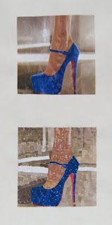
An accurate drawing will make the process easier, but the priority today is matching colors. Use cut paper from magazines (there are many in the classroom) and find colors that match the original photo as closely as possible. Cut these to small pieces, no larger than a 1/2" in any direction, and glue them to the drawn box to match the source photo. Below are a few examples from previous semesters:
In each case we see the original photo and the student copy they made. There can be a slight space between color pieces (like grout in a tile wall) or they can overlap, if it is easier for you. Speckles and thin lines of color can appear on top of other colors if it makes sense for your image.
This is a portfolio exercise, and thus due by the end of the semester, but I suggest dealing with it sooner than that. Of all the parts of the portfolio, this exercise is the one that students are less likely to finish, leaving behind the points that would go with it.
Homework- Nothing new yet, but just remember that the rough draft of the museum assignment is due in about a month. If you haven't done your museum visit yet, do it soon.
Kean requires us to provide mid semester evaluations to students and advisors this week, so you'll receive that through KeanWise. This has nothing to do with your semester grades, and you won't be getting any letter grades at this point because I have no grades for you yet, so I'll just be selecting comments from the drop down menu.
For next class Feb 28, 2020- More color, but this time you'll be making them. This will be classic color theory, using your watercolors to produce a color wheel, to explore color mixing, complements, etc. Bring your large pad of 18" x 24" paper, set of watercolor paints, brushes, pencil and eraser. Right now there are things that can function as water cups and mixing palettes in the room, but I can't guarantee they will be there next week, so it may not hurt to have your own.


